DIYRO KIWIYA
One identity, built to survive many expressions.
The decision system behind DIYRO KIWIYA. It keeps identities, websites, presentations, marketing, and automation recognisably one studio.
- Status
- Living studio system
- Project type
- Brand identity
- Year
- 2026
- Format
- Case study
Brand foundation
DIYRO KIWIYA is a design studio, run by Yurii Shyrinian. It develops client-specific decisions across identity, digital products, marketing, and automation, then turns them into a visual language the business can own and use.
Positioning
DIYRO KIWIYA works at the point where a business is being misunderstood, forgotten, or visually blended into its category. The result is a set of decisions — and a design language — that belongs to that business rather than the market around it.
Personality
The mark carries Armenian heritage through colour: vitality and renewal, attention and peace, warmth and craft. The voice follows the same balance — observant, warm, and direct.
Audience
Founders and teams with a credible offer whose identity no longer distinguishes it, whose product and communications have drifted apart, or whose new venture needs to be understood quickly without looking familiar.
Promise
A distinct visual language that works across print, screen, product, and physical space — with rules clear enough for the team to keep it recognisable without returning to the designer for every decision.
The brand name is DIYRO KIWIYA, and in running text it naturally shortens to "the studio" after the first mention. The founder is Yurii Shyrinian — the face when it comes to people and conversation, while the studio is the entity behind every delivered project.
The mark
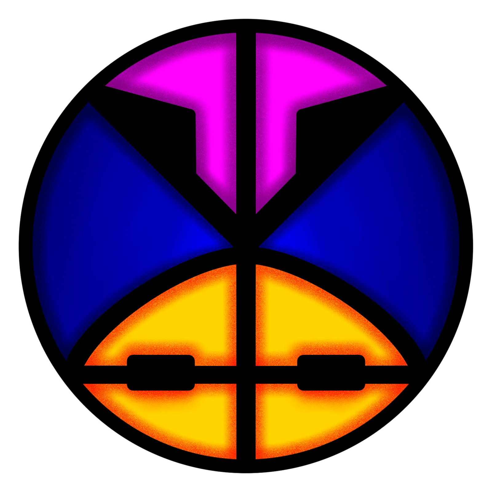
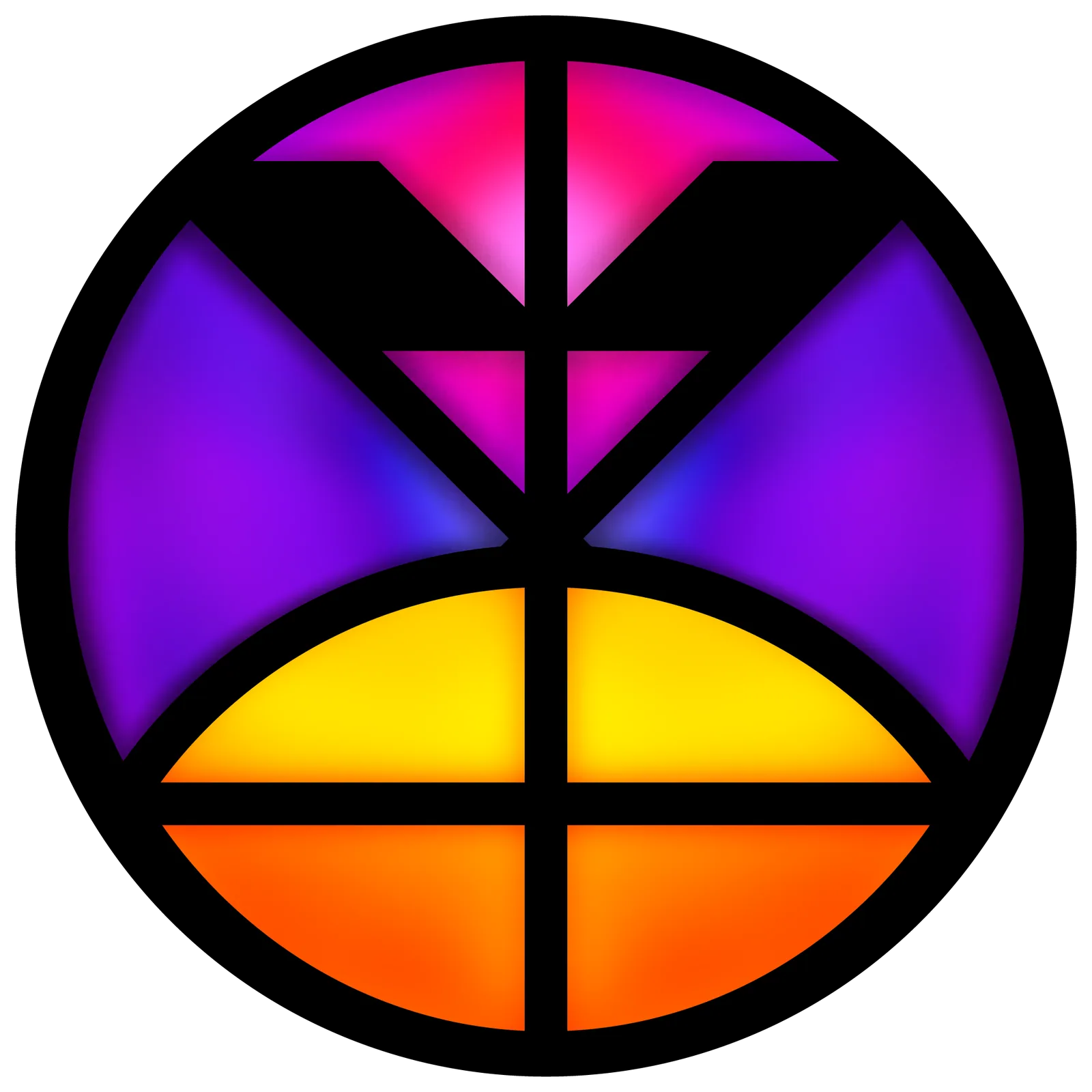
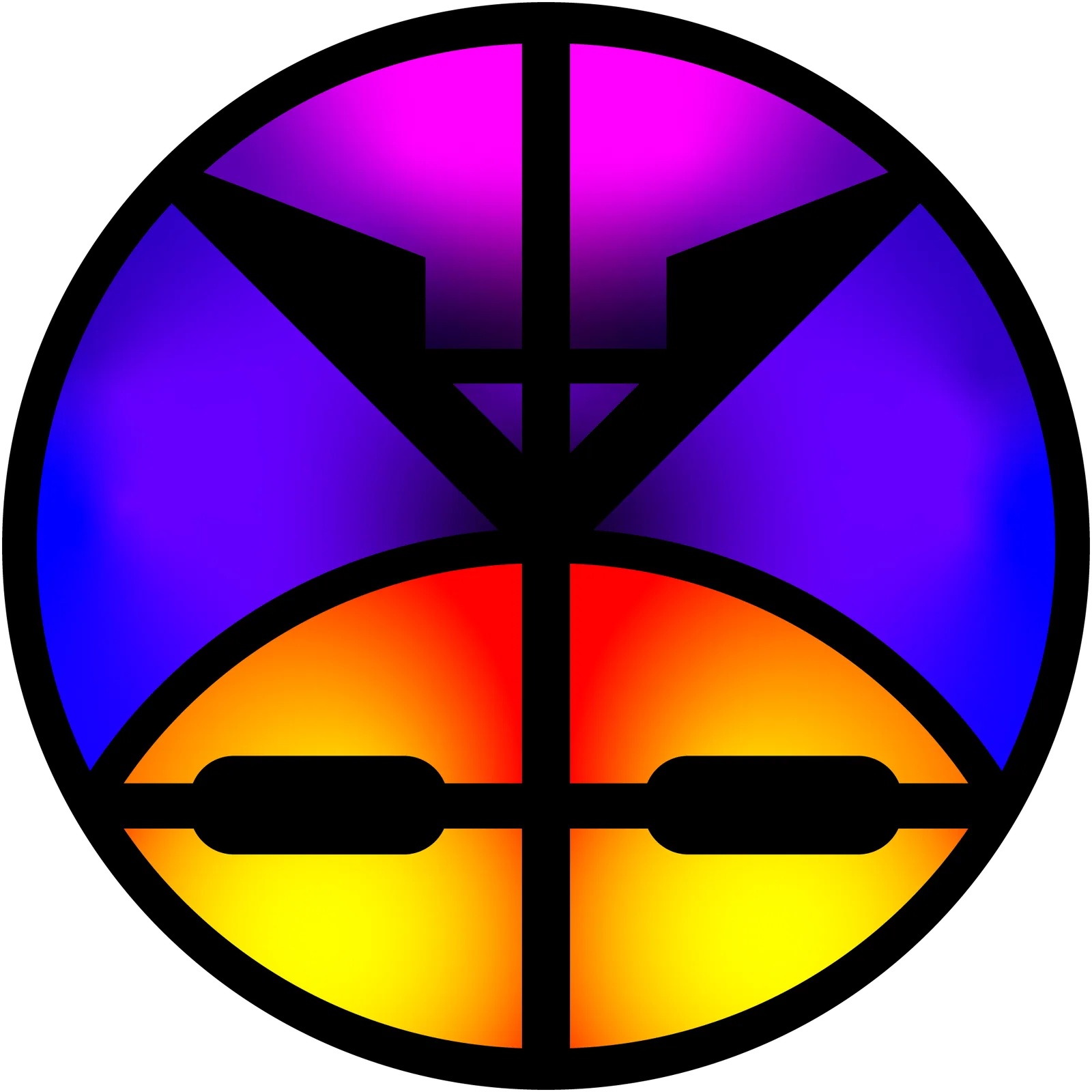
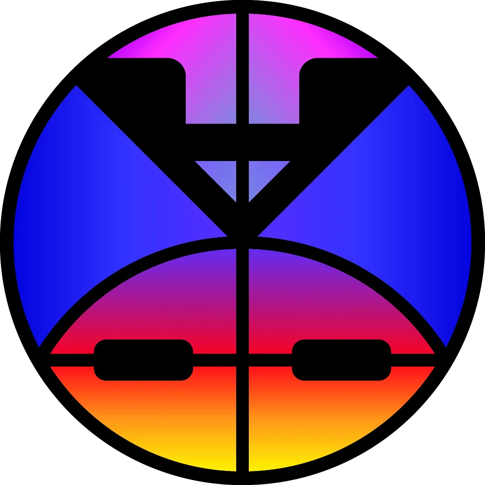
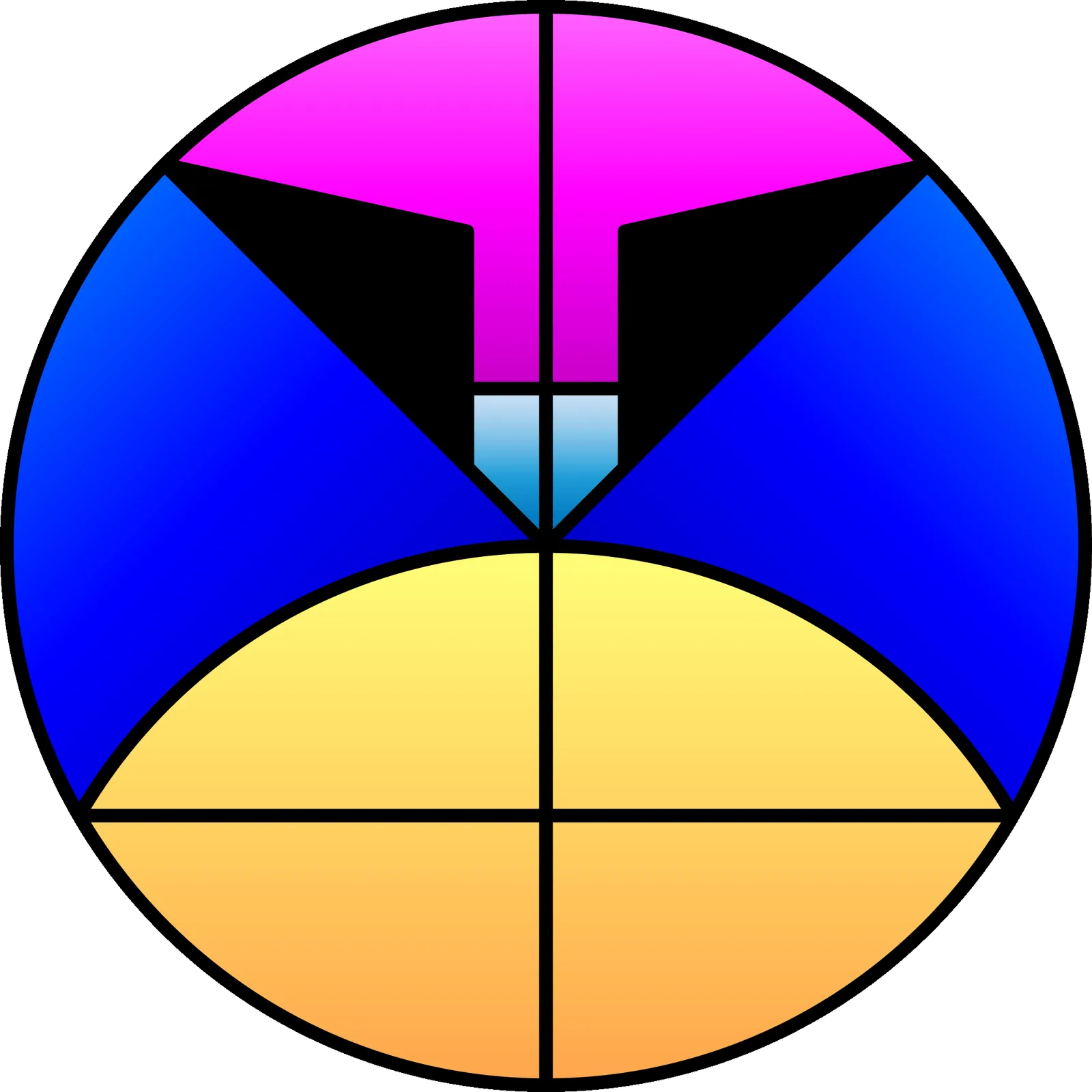
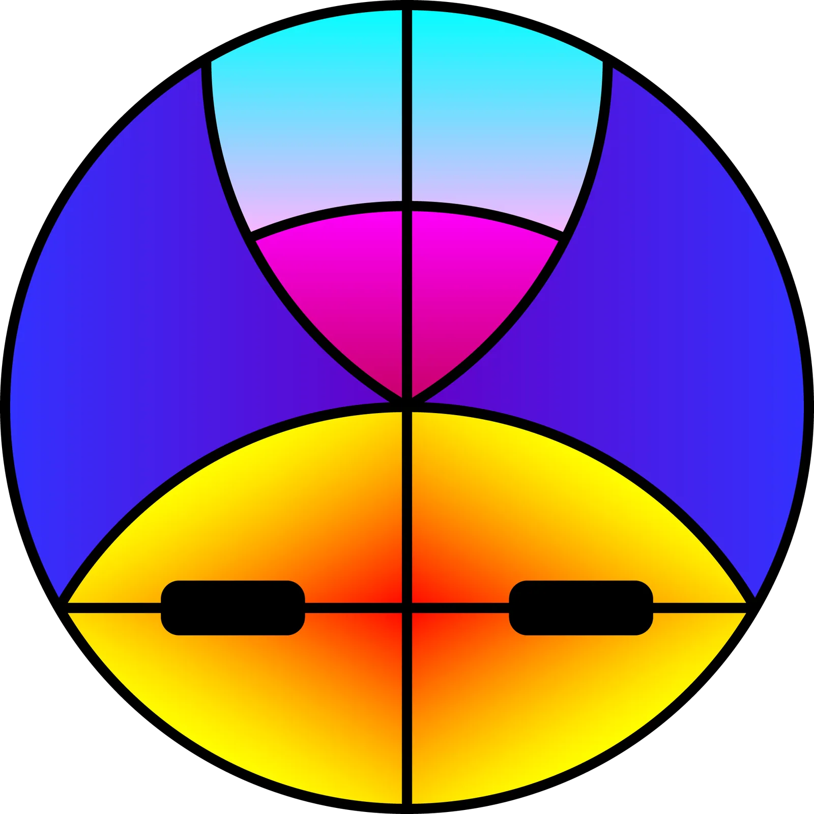
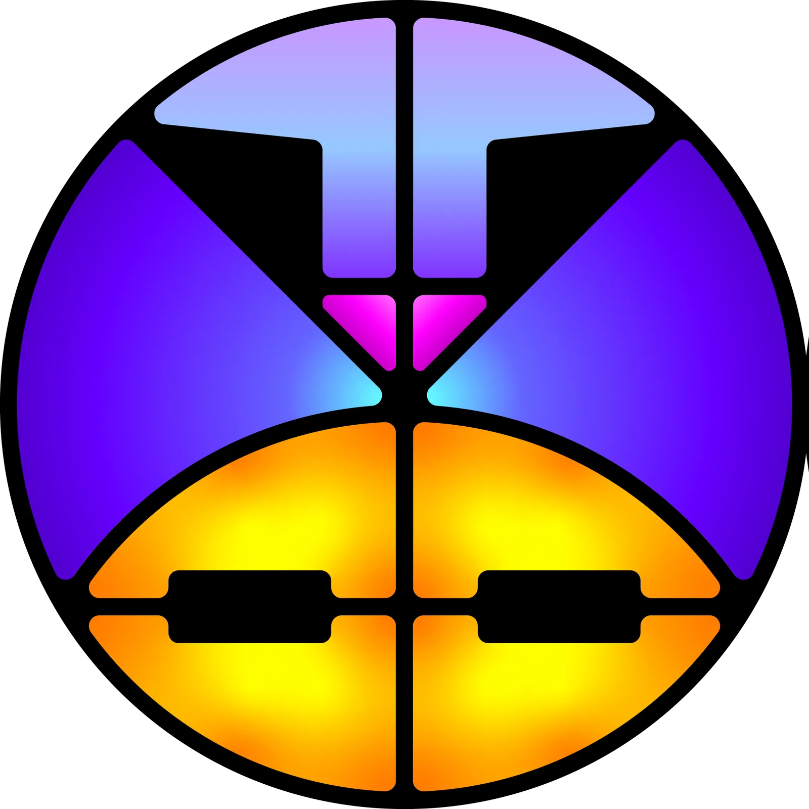
The mark has three zones: the magenta-to-red crown, violet-to-blue lenses, and gold-to-yellow furnace. DIYRO KIWIYA letterforms are built into the geometry. Use the #121212 outline everywhere except pure black, where it switches to white.
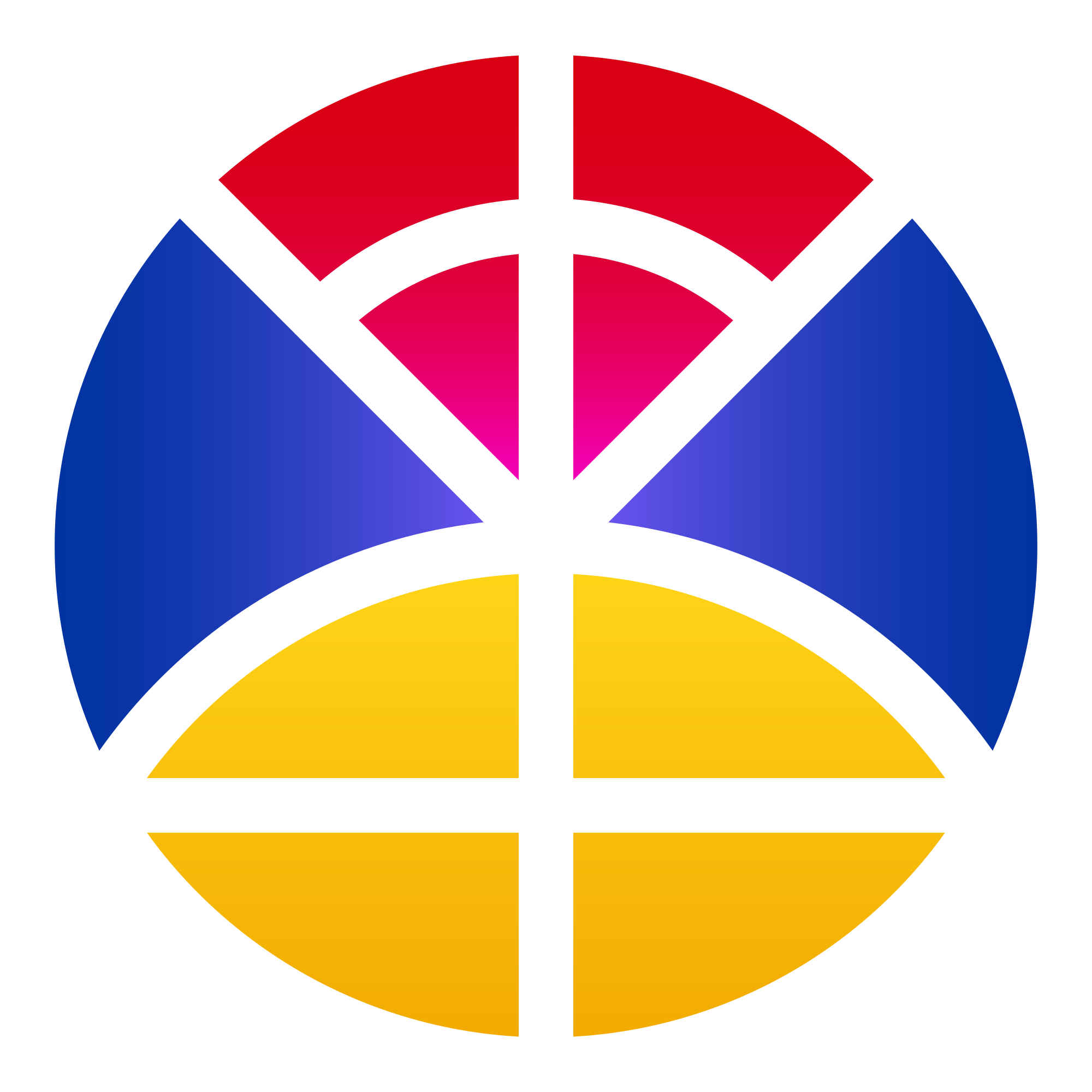
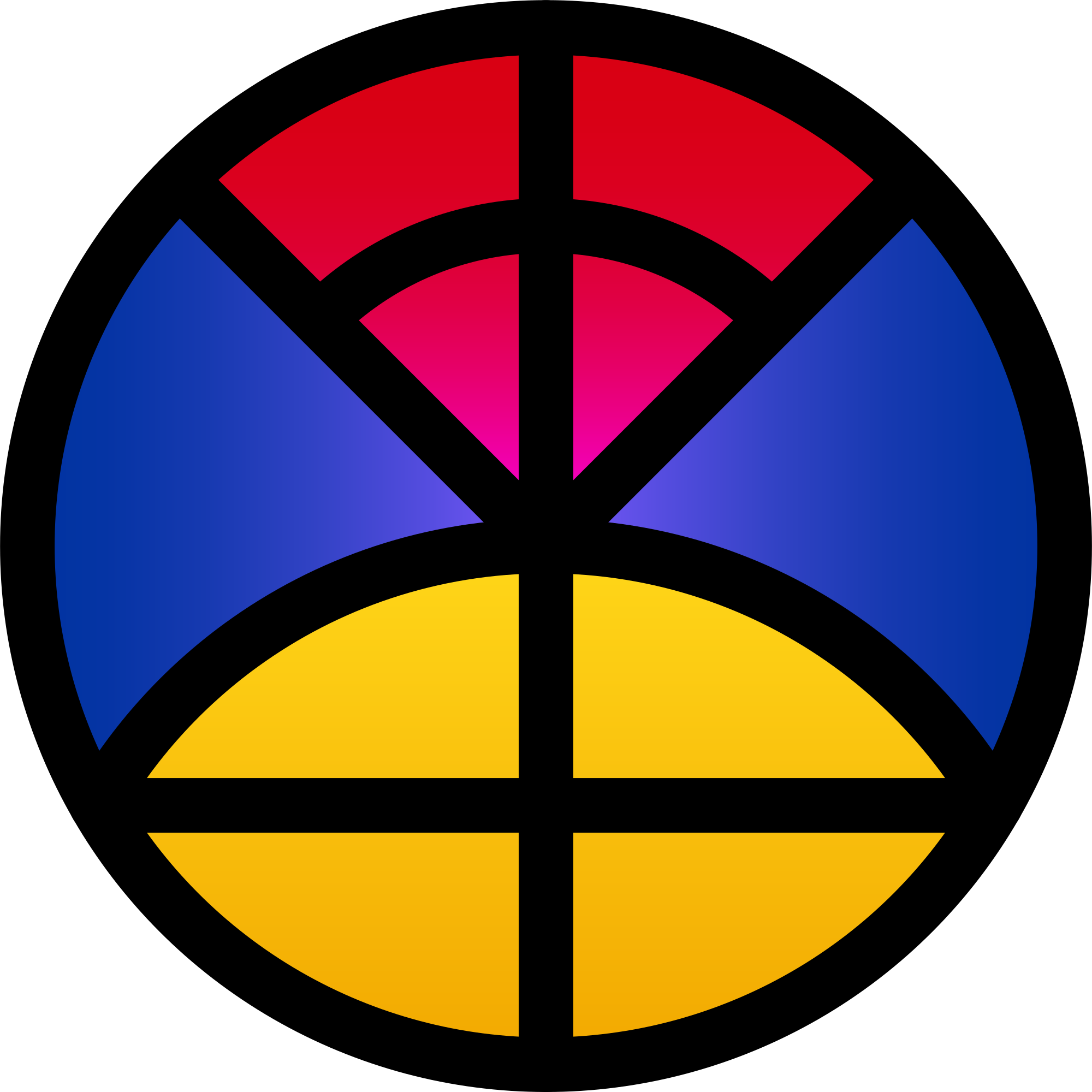
A vertically symmetrical geometry guarantees visual stability. The outline acts as the primary structure, enabling the mark to scale down cleanly to a single-color favicon or expand as a high-fidelity brand signature.
Anatomy
| Zone | Color behavior | Meaning / Role |
|---|---|---|
| Crown (upper arc) | Linear vertical gradient, magenta → red stroke: #000000 (0.178px) | Armenian national heritage: sacrifice turning into renewal. Magenta adds historical depth. |
| Lenses / Eyes (sides) | Linear horizontal gradient, violet → blue | Precision and focus: noticing details, observing, and learning. Blue stands for peace. |
| Furnace (lower oval) | Linear vertical gradient, gold → yellow | The creative kiln: shaping ideas into fresh, warm, and beautiful forms. |
| Strokes | Solid outline (#121212 or #ffffff) | Binds the geometry. Uses #121212 on all backgrounds, switching to #ffffff against pure black. |
Clear space & minimum sizing
Protect the mark with breathing room. Clear space on all sides equals 25% of the mark's width (¼ of the diameter). Nothing — text, edges, other logos — enters this zone.
Minimum sizes
| Context | Min size |
|---|---|
| Digital — full mark | 32 px |
| Digital — favicon path | 16 px |
| Nav logo (site) | 40–48 px |
| Print — full mark | 10 mm |
Below 32 px, switch to the favicon compound path. Below 16 px the six-zone color collapses — use a solid single-color version instead.
Logo container (nav / app)
In the navigation and app contexts the mark sits inside a squircle container ≈ 48px corner radius, with the mark occupying ~64% of the container. This is the only approved "framed" treatment.
Logo misuse
The mark’s integrity comes from consistent geometry and a recognisable chromatic signature — but it is also designed to be versatile and adaptable when the context demands it.
Always
- Use the supplied vector (SVG) as the starting point
- Keep the three-zone gradient signature intact (crown, eyes, furnace; sides are mirrored)
- The outline can be placed against virtually any colour — paint it white, black, gradient, or any colour the design demands
- Preserve full clear space
- Use the favicon path below 32px
- Consistency is the highest priority — stylise freely, but keep it recognisable across all applications
Avoid
- Replacing the gradient zones with unrelated colours — though flat single-tone fills (blue for the eyes, orange for the furnace, crimson for the crown) are an accepted simplification for contexts that require higher readability or single-colour reproduction
- Re-creating or approximating the mark from scratch — always start from the real file
- Cropping the circle or letting elements invade clear space
- Inconsistent styling across a single project — once a stylistic direction is chosen for the mark, it holds across every touchpoint of that project
Stylisation rules
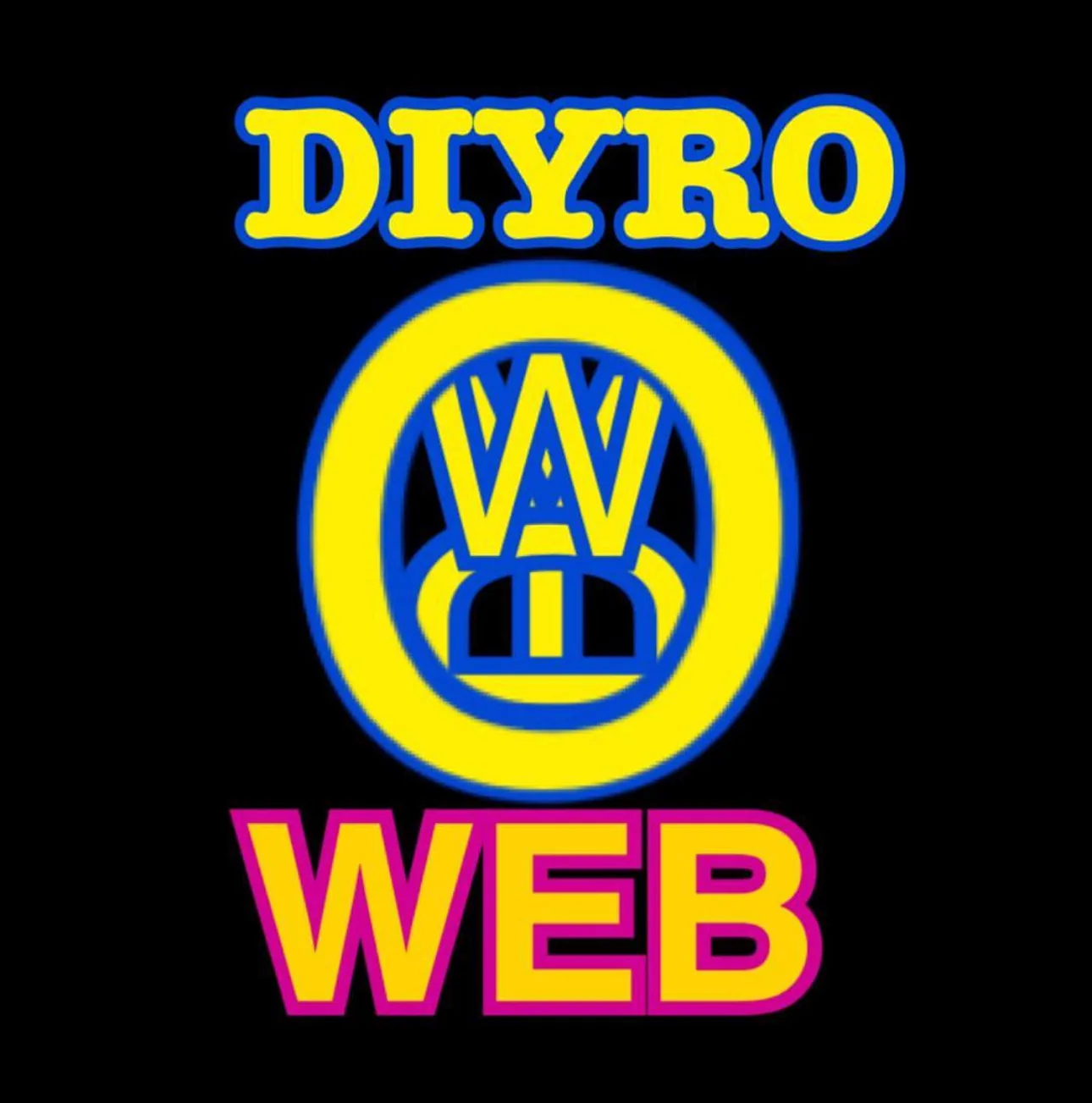
The mark is designed to be stylised to match the visual language of the platform or project it lives on. The DIYRO KIWIYA logo on TikTok, for example, carries the same RGB-shift glitch effect as TikTok’s own mark — adapting the logo to a platform’s aesthetic while keeping it unmistakably itself.
- The outline can and should be stylised: painted white, coloured, given a gradient, even placed directly over photography with a contrasting stroke
- The favicon on dkiwiya.com is an outline with a gradient applied to it — this is a canonical example of approved stylisation
- Effects like glow, glass, or bevel are not prohibited if they serve the project’s aesthetic — they follow the stylisation rules, not the misuse list
- Adaptation (rotation, glitch, motion effects) is acceptable when the project’s design language calls for it, as long as the mark remains recognisable
- The one non-negotiable: consistency within a project. Pick a style, and hold it across every touchpoint.






Color system
The palette is a single intentional tonal range expressed two ways: the named system palette (used in UI, code, and applications) and the mark's true gradient stops (used inside the logo). They are deliberately related but not identical — the named palette is the brighter, screen-optimized expression of the deeper gradient tones inside the mark.
The named accents (e.g. red #E5194A) are not the literal hex values inside the SVG (crown top is #d90012). This is intentional and recorded: the mark uses deep, saturated gradient stops for physical reproduction richness; the UI palette uses brighter, more legible screen values. Treat them as one family — do not "fix" one to match the other. If a future re-export unifies them, update this section.
Foundation neutrals
Named system palette
Use for accents, links, focus states, data viz, and atmospheric glow. Never more than one accent dominant per view.
Mark's true gradient stops
These stops live inside the logo SVG only. They provide rich tonal transitions for high-resolution rendering and physical reproduction.
Crown — linear (vertical, 0° bottom-to-top)
#FF00FF → #FB00EC (3%) → #F300B9 (13%) → #EC008C (24%) → #E60066 (35%) → #E10047 (46%) → #DD0030 (58%) → #DB001F (70%) → #D90015 (83%) → #D90012
Lenses / Eyes — linear (horizontal, centre-to-edge)
#805AFF (centre tone) → #564DE0 → #3142C4 → #1639B0 → #0534A4 → #0033A0 (outer edge)
Furnace — linear (vertical, 0° bottom-to-top)
#F2A800 → #FFD719
Borders & lines
| Token | Value | Use |
|---|---|---|
| Structural line | rgba(240,237,232,0.08) | Default card / section borders |
| Hover / active line | rgba(240,237,232,0.13) | Interactive emphasis |
Typography
Plus Jakarta Sans is the exclusive typeface across the entire brand. No serifs. No Inter, Roboto, Arial, or system stacks. The type does the heavy lifting: tight tracking and 800 weight at display sizes create the structural, premium feel.
Type scale & rules
| Role | Weight | Tracking | Case |
|---|---|---|---|
| Display / H1 | 800 | −0.04em | Sentence or UPPER |
| H2 | 800 | −0.035em | Sentence or UPPER |
| H3 | 700 | −0.02em | Sentence |
| UI / buttons | 600 | 0 | Sentence |
| Body | 500 | 0 | Sentence |
| Eyebrow / meta | 400 (mono) | +0.1 to +0.28em | UPPER |
The mono accent font is JetBrains Mono, used for eyebrows, counters, technical labels, and metadata. Mono is never used for body copy.
Layout & grid
Apple-inspired refined dark luxury. Centered compositions by default. Bold, structured, symmetrical. Left-alignment only inside data-dense components.
Alignment
- Centered — hero, section headers, standalone cards, contact
- Left — capability lists, project metadata, tables, dense data
Geometry
- Cards / surfaces: 22px radius
- Pills / buttons: 100px radius
- Logo container: squircle ≈48px
Navigation
The navigation on dkiwiya.com is an expanding/minimising pill containing the logotype. It collapses on scroll and expands on hover or at the top of the page. Backdrop blur and a subtle border appear as context when over content.
Spacing scale
Section vertical rhythm: 90px desktop / 60px mobile. Content max-width ~980–1100px, centered.
Components
- Work cards — squircle 22px, real screenshot background, hover scales image + reveals "View case study →"
- Stats row — directly below hero CTA, separated by a top border
- Ticker — full-width scrolling strip between hero and work, masked at both edges
- Capabilities — numbered left-aligned rows: index · discipline (800) · tag pills
Grain & glow
Two atmospheric layers are non-negotiable and present on every surface: a grain overlay and accent glows. They are what separate the brand from a flat dark template.
Grain
Subtle fractal-noise texture at ~2.5% opacity over the entire viewport, fixed, non-interactive, above content. Implemented as an inline SVG feTurbulence data-URI (this very document uses it).
Glow
Large radial gradients in accent colors at 6–16% opacity, heavily blurred (~120px), behind content. Use blue + red + orange sparingly for depth — never so strong they read as color fields.
Motion & intro animation
Motion is Apple-grade: calm, eased, purposeful. Default easing cubic-bezier(0.16, 1, 0.3, 1), durations 0.3–0.6s. Nothing bounces or spins decoratively.
Scroll-driven animations
- Animations are scroll-driven and reversible — they change continuously with the user’s scroll position, not once per session
- Sequences the logo lineage using actual asset files — never approximations
- The logo evolution is presented as a horizontal scroll gallery (Cover Flow-style, like vinyl records in early iPod/iOS): as the user scrolls down, the logos scroll horizontally
- Progress dots + a text label identify each era
- The final logo is always the canonical SVG
- A Skip button is always present
Interaction motion
- Cards: lift + image scale on hover, 0.4–0.5s ease
- Buttons: subtle translateY on hover/active
- Scroll reveals: 30px rise + fade, staggered, scroll-reversible
Voice & copy
The studio’s voice is literary, varied, and confident — sentences that explain, describe, build context, and then land a concise point when it matters. Not choppy three-to-seven-word AI-style bullets, and never corporate filler. The writing is dense where it needs to be, clear where it should be, and always respectful of the reader’s intelligence.
Sounds like
- "Identities, products, marketing strategies, systems — everything the brand needs, the studio designs."
- "People trust what is known, predictable, and stable. The studio’s systems provide exactly that."
- "Dense where it needs to be, never tiring to read."
- "An honest assessment of whether the studio is the right fit for the project."
Never sounds like
- "We leverage synergies to deliver world-class solutions." — pseudo-professional jargon that sacrifices understanding for the illusion of expertise
- "Passionate about pixel-perfect design!" — exclamation-driven hype
- Short. Punchy. Always. — AI-pattern sentence fragments that strip writing of its personality and reduce the level of professional perception
- Humble-to-forgettable hedging ("just a small studio")
Mechanics
- Person: the studio voice is impersonal — focus on what was built, not who built it. "The studio" or "DIYRO KIWIYA" for the entity. Projects are described by their results, not their maker.
- Capitalization: sentence case for copy; UPPERCASE reserved for mono eyebrows/labels.
- Numbers: mono font, used as structural markers (01 / Featured).
Application standards
SEO & metadata
| Field | Standard |
|---|---|
| Title | DIYRO KIWIYA — Brand, Product & Marketing Design Studio |
| Description | One sentence, ≤160 chars, names the lanes the studio works across. Emphasis on working globally. |
| Theme color | #121212 |
| OG image | 1200 × 630 |
| Locale | en_US primary; ua, ru alternates |
| Structure | One <h1> per page; semantic header/main/section/footer/nav; alt text on all images |
Favicon & app icons
Use the favicon compound path from the SVG. Provide 16, 32, 180 (apple-touch), 512 (PWA). On the smallest sizes, ensure the K cross stays legible — test against both light and dark browser chrome.
Social & OG
OG image: mark on near-black with a single accent glow, wordmark in Plus Jakarta 800. Keep the safe area centered. One accent per card.
Stationery / merch (when needed)
Near-black or off-white grounds only. Mark + wordmark lockup centered or top-left. Spot-gradient reproduction should target the mark's true gradient stops (§06), not the brighter UI palette.
The disciplines shaping this result.
Turn the business decision into signals people recognise and remember.
View discipline Design languageDefine how recognition adapts without drifting.
View discipline Digital experienceTurn recognition into an experience people can understand and use.
View discipline Brand operationsMake the brand easier to run without automating away judgment.
View disciplineLiked the project?
Tell me what you are building. I will reply with an honest fit check and a practical first scope.