Brand identity
Cup of Power
The trophy is the muscle.
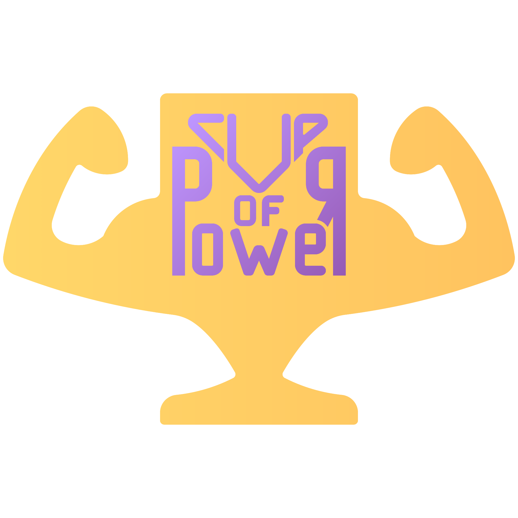
A strength brand compressed into one silhouette. Two flexing arms form a trophy, with a custom wordmark drawn into the cup.
- Status
- Self-initiated concept
- Project type
- Brand identity
- Year
- 2023
- Format
- Case study
01 / Meaning
Strength is shaped as the trophy.
The original presentation positions Cup of Power as a strength-product brand built around inherited ideas of majesty and physical power. The arms and the cup are not stacked symbols: they are one silhouette.
02 / Packaging
All the sizes the product line needs.
The identity is applied to the five real packaging designs developed for the product line. The same compact mark remains the anchor while format, colour, and product information change around it.
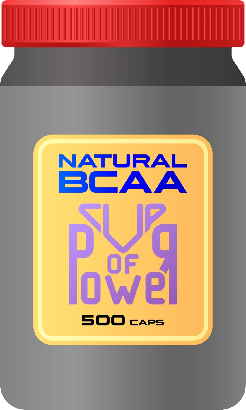
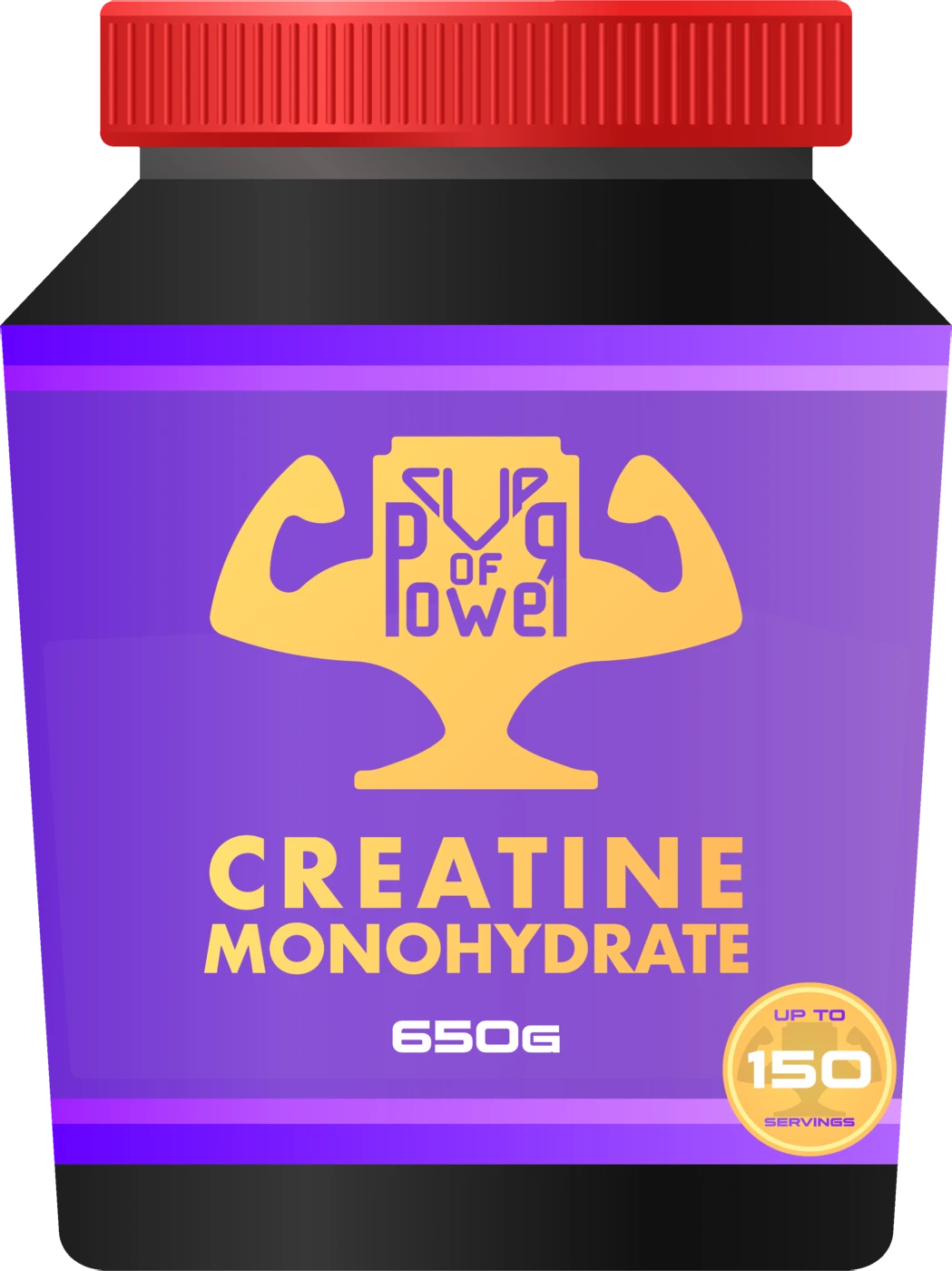
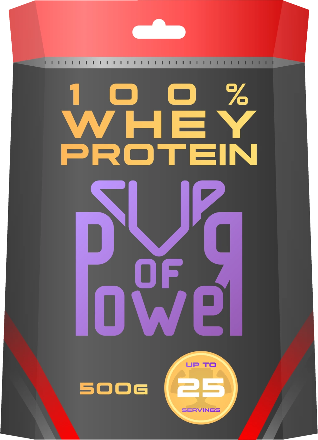
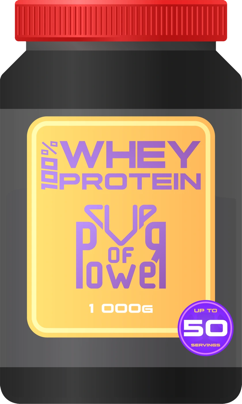
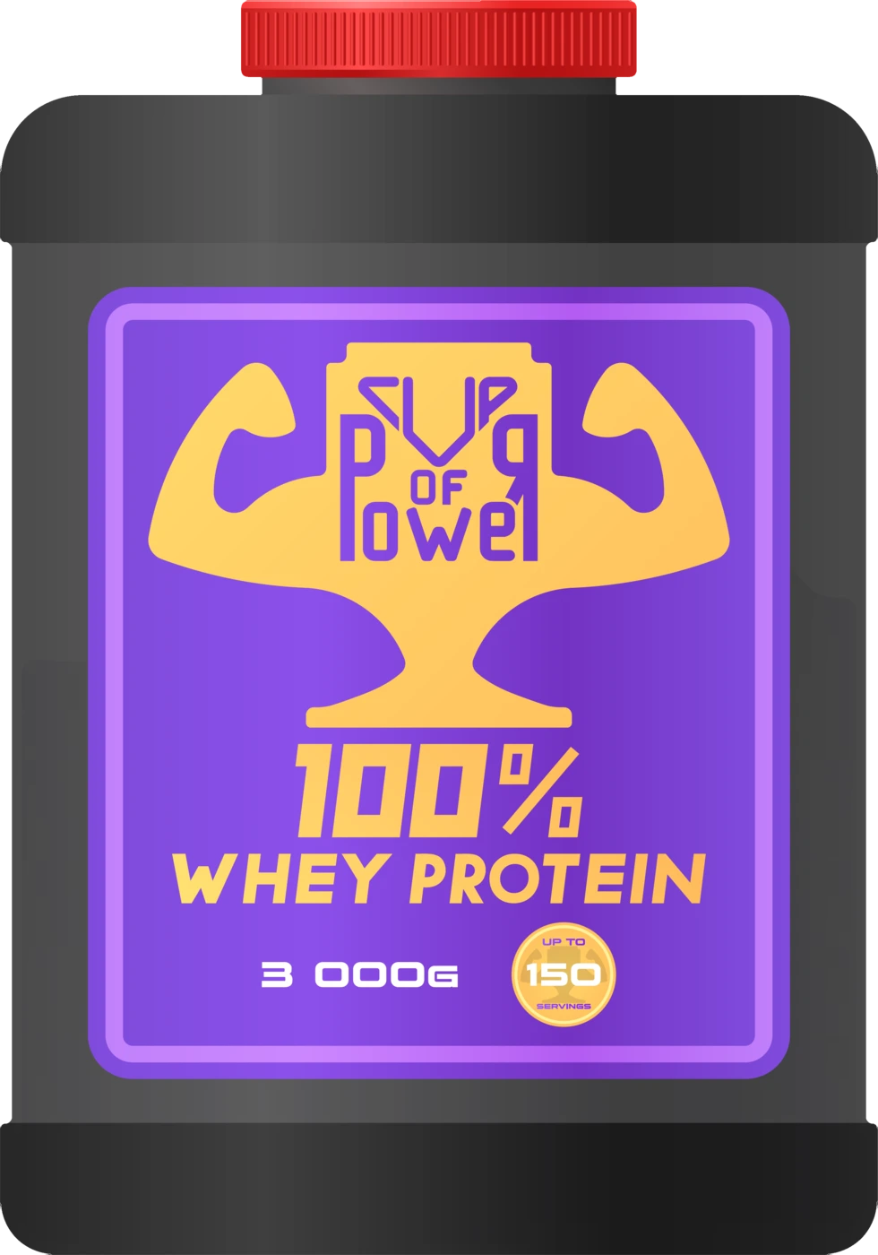
A complete identity concept, shown at product scale.
- 01Updated primary logomark
- 02Integrated wordmark
- 03Five packaging designs
- 04Packaging range direction
- 05Brand presentation
The disciplines shaping this result.
Liked the project?
Tell me what you are building. I will reply with an honest fit check and a practical first scope.